About This Site
Accessibility
Introduction
This site is mostly text and most pages does not have too many accessibility issues. In August 2023, I decided to attend to the issues the site still has. I wanted to keep the look and feel of the site more or less as it is in August 2023, but to make the pages more accessible. As with the other updates to the site, this will take place on a page by page basis as they are updated or created. This page gives details of some of the accessibility issues the site has and how I tried to mitigate them.
The information on this page led to an update of the entire site or at least those pages that get updated or created. There's a test page I created to put the ideas on this page into action.
Testing
The W3C page Web Accessibility Evaluation Tools List has 160 validators. As I mostly use Chrome, I installed two Chrome Browser Extensions, axe DevTools and WAVE. I also use the online AccessiBe accessScan, Accessible Web, AChecker, ADAScan βeta, and Intent Based Accessibility Checker to check my pages.
The above checkers are free to use. Although free, I reached a limit of how many pages Accessible Web can scan. Experte Accessibility Check checks all the pages it can find on a web site so it takes a time to complete but it does make a separate report for each page it scans.
As with any test suites, some of them have a different focus than others and so there are sometimes variation in what they report.
I tested various pages I have written over the years in all seven suites:
 |
Apart from not having semantic HTML landmarks, the main problems with these original 1999 pages was the language was not specified in the HTML and the images lacked alt text. The font tag used on these pages are also reported as being not following the accessibility guidelines. AccessiBe accessScan gave this page a score of 50, Accessibility Checker gave it 34 and Accessible Web gave it 88. |
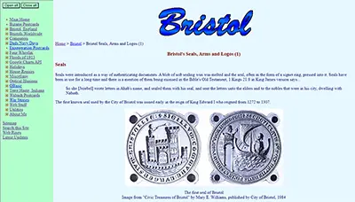 |
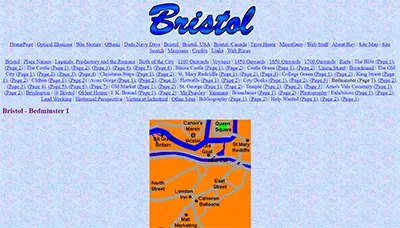
Apart from not having semantic HTML landmarks, the main problems with these 2010 design pages was the language was not specified in the HTML and the frame the menu sits in did not have a title. AccessiBe accessScan gave this page a score of 50, Accessibility Checker gave it 56, and Accessible Web gave it 97. |
 |
Apart from not having semantic HTML landmarks, the main problems with these 2014 design pages was the language was not specified in the HTML. This was the design that introduced the CSS text-shadow effect in the header and that causes colour contrast issues in the checkers. AccessiBe accessScan gave this page a score of 50, Accessibility Checker gave it 68, and Accessible Web gave it 98. |
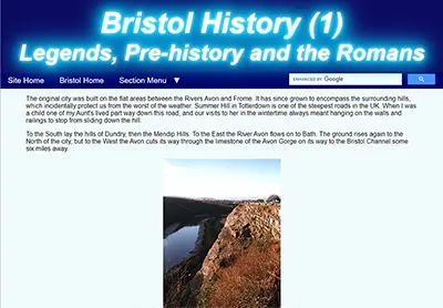 |
Apart from not having semantic HTML landmarks, the main problems with these 2020 design pages was the CSS text-shadow effect in the header that causes colour contrast issues in the checkers. AccessiBe accessScan gave this page a score of 56, Accessibility Checker gave it 77, and Accessible Web gave it 98. |
The site's pages accessibility have improved over time but there are many improvements that can be made.
Tables
As written, even the simple two column table above is not very responsive. Because the table rows in the columns are the same height, as the viewport gets narrower, the right column becomes narrower and the height of the text cell becomes longer, making it more difficult to read and forcing the images farther apart.
Although not reported as not accessible the above table layout is also not very good on portrait mode mobile devices as the text is chopped off and is even unable to be scrolled to.
The above table in a narrow viewport on PC and mobile device
One method to mitigate this would be to use responsive tables. CSS Tricks examined the various ways this can be done in two articles, Responsive Data Tables and Responsive Data Table Roundup.
Another method would be some sort of div arrangement that would allow the text to be shown alongside the image in wide mode but move it under the image on narrow screens. Another would be a flexbox arrangement to do the same. Some of the best guides to both Grid and Flexbox are on CSS Tricks. In the end I chose a Flexbox solution for updated and newly created pages.
Tables on some of my older pages are not always semantically correct. This is being addressed on updates and future pages.
Semantic HTML, Landmarks, and Roles
My site has never properly used main semantic HTML tags and labels to differentiate the different sections of the pages. This is being addressed on updates and future pages.
Many semantic elements in HTML have a role and landmark roles provide a way to identify the organization and structure of a web page. Landmark roles have a semantic HTML equivilent and need not be used but there others such as those listed on WAI-ARIA Roles that may need consideration.
Here is the markup for this page which is used on all my pages using the 2020 design. There is nothing semantic about it at all...
<!DOCTYPE html>
<html lang="en">

<head>
<meta http-equiv="Content-Type" content="text/html; charset=utf-8">
<meta name="author" content="Ray Thomas - brisray@yahoo.co.uk">
<meta name="description" content="About this site: Accessibility">
<meta name="keywords" content="about, accessibility, ADA, test, audit, semantic">
<meta name="viewport" content="width=device-width, initial-scale=1">
<link rel="stylesheet" type="text/css" href="../common/brisray2020-min.css">
<title>About this site: Accessibility</title>
</head>

<body>
<div id="page-div">
	<div id="title-div">
		<h1>About This Site</h1>
		<h2>Accessibility</h2>
	</div>
	<div id="mainnav-div">
   		<div id="site-home" class="menu-item"><a href="../">Site Home</a></div>
		<div id="section-home" class="menu-item"><a href="./">Utilities Home</a></div>
        <input type="checkbox" id="show-menu" role="button">
		<label for="show-menu" id="section-menu" class="menu-item"><span id="menu-down">Section Menu   ▼</span><span id="menu-up"> Section Menu   ▲</span><span id="hamburger">☰</span></label>
	   	<div id="google-search"><!--#include virtual="../common/google-search.htm" --></div>
        <div style="clear:both;"></div>
    	<div id="menu-div"><!--#include virtual="inc/utilities_menu.htm" --></div>
    </div>

    <div id="content-div">

	(Page content)

	<h5 class="ctr">This page created August 28, 2023; last modified September 3, 2023</h5>

</div></div>
<div id="footer-div"><!--#include virtual="../common/footer.htm" --></div>
</body>
</html>
CSS
Semantic HTML tags can be styled with CSS the same as any other element. Things such as header p {...} and footer p {...} are perfectly valid.
Article vs Section
The more I read about these two semantic tags the more confused I became. Through my reading it seems other people are as well. After reading the MDN Web Docs pages for the <article> tag and the <section> tag, it seems that the various parts of my pages are sections rather than articles.
Search Area
My page contains a search area in the header and places like Stack Overflow contain queries from people asking how to semantically mark these areas. Luckily there's an ARIA search role and that should be used to identify it.
Which to use?
ARIA Landmark roles came first, and were supported by assistive technologies before HTML5 semantic elements were. However, that was well over a decade ago, and assistive technologies have supported both methods for many years. Therefore, it is always best to use HTML first, and turn to ARIA only as a last resort.
Page Titles
The 2014 redesign introduced a pronounced diffused drop shadow effect to the page title text. Several of the accessibility testers marked this as being difficult to rread as the text colour had insufficient contrast against the background colour. In the 2023 redesign, the effect was toned down to make the titles more readable.

2014 page title text
The CSS to do this was changed from...
text-shadow: 0 0 10px #fff, 0 0 20px #00d2ff, 0 0 30px #00d2ff, 0 0 40px #00d2ff, 0 0 50px #00d2ff, 0 0 60px #00d2ff, 0 0 70px #00d2ff;to
text-shadow: 0 0 10px #00d2ff, 0 0 20px #00d2ff, 0 0 40px #00d2ff;to give...

2023 page title text
Main Menu
I was surprised when I started writing this section by just how difficult it is to write a fully accessible dropdown menu. CSS3 was introduced in 2005 and HTML5 in 2008 and in 2023 there's still no standard method of writing them without a lot of CSS and JavaScript.
My main menu is really simple, Home, Section Main Page and Section Menu, which is a dropdown. I may change the Home menu item to All Sections which lists all the sections on the website. How I want them to behave is when the link for a dropdown is hovered over, then the dropdown itself is also a hover menu, that is when the cursor or focus is moved off the main menu item then the dropdown menu disappears. At the same time, if the main dropdown link is clicked on, then the dropdown menu is "sticky" and only disappears when it loses focus or the main menu item is clicked on or the Esc. key is pressed.

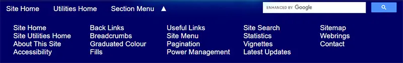
Main menu showing tabable links
The dropdown section of the main menu was not reachable using the tab key and not actionable through the keyboard because it uses the "checkbox hack" and that has accessibility problems.
The checkbox hack is a technique where a label and hidden checkbox is used. By clicking on the menu item the checkbox is toggled between checked and unchecked and the CSS hides or unhides the dropdown menu depending on its state...
/* Process the "section menu" elements*/
#menu-up, #hamburger, #show-menu {display:none;}
#show-menu:checked ~ #menu-div {display:block;}
#show-menu:checked ~ #section-menu #menu-down {display: none;}
#show-menu:checked ~ #section-menu #menu-up {display: inline-block;}
The hamburger menu is a menu that shows on mobile screens.
The menu showing when "Section Menu" is clicked on. Notice the up/down arrow changes direction
For the next version of this menu I am thinking of having just two dropdowns. One to show a list of all the sections (the equivalent of the home page), and one showing the contents of the current section, which is being used now.
What I would like for it to behave is that when the menu submenus are closed then the items can be tabbed through without opening them. If they are hovered over then the dropdowns should open but close again when they lose focus - the cursor is no longer over them. Opening the dropdowns should be able to be done by clicking on them, or tabbing to them and pressing the spacebar, up/down keys or enter key. In all these cases the dropdowns are "sticky" and can be tabbed through. Menu items can be clicked on or by using the enter key. If needed the dropdowns can be closed by clicking outside of them or pressing the Esc key.
tabindex="0"
It is possible to force the dropdown section to be included in the keyboard tab navigation by adding tabindex="0" to the "Section Menu" element but it does nothing for keyboard usability without adding code to ensure something happens. See Keyboard-navigable JavaScript widgets.

Main menu showing tabable links after adding tabindex="0" to the menu code
The original HTML code for the menu is:
<label for="show-menu" id="section-menu" class="menu-item"><span id="menu-down">Section Menu ▼</span><span id="menu-up"> Section Menu ▲</span><span id="hamburger">☰</span></label>
After adding tabindex=0 the code became:
<label for="show-menu" id="section-menu" class="menu-item"><span id="menu-down" tabindex="0">Section Menu ▼</span><span id="menu-up" tabindex="0"> Section Menu ▲</span><span id="hamburger">☰</span></label>
Solved with CSS! Dropdown Menus on CSS Tricks shows methods to get around this problem but I prefer to keep the "sticky" dropdown.
I decided not to pursue this idea any further as surely there are easier methods?
W3C WAI ARIA Menu
The W3C (World Wide Web Consortium (W3C)) WAI (Web Accessibility Initiative) has an ARIA (Accessible Rich Internet Applications) example navigation menu. Even this is problematic as the page says that the code "is not intended for production environments" which is not very encouraging and the HTML for it is longer than some of my pages and the CSS and JavaScript is longer than what I use for my entire site. They also provide a Disclosure Navigation Menu and Editor Menubar Example which even though simpler still have the same warnings and a lot of code. As the menu would be used on every page this may not be an entirely bad thing but surely there are easier methods?
Buttons
In February 2023, I wrote JavaScript Toggles explaining how to toggle between values, including Boolean true and false values, using JavaScript. On that page I used this:
The HTML to do this is simply:
<p><button type="button" onClick="boolSwap()">Toggle Boolean</button> <span id="showBool"></span></p>
While the JavaScript is just:
<script type="text/javascript">
var bool1 = false;
function boolSwap() {
bool1 = !bool1;
document.getElementById('showBool').innerHTML = bool1;
}
</script>
The beauty here is that buttons are tab key accessible and can be activated by both the enter key and spacebar.
Let's show or hide a div depending on the value of the variable bool.
The HTML for the button and menu div is:
<p><button type="button" onClick="toggleDiv()">Show/Hide Div</button></p>
<div id="fakeMenu1" class="ctr" style="display: none;">
<a href="#">Choice 1</a><br>
<a href="#">Choice 2</a><br>
<a href="#">Choice 3</a><br>
</div>
<div id="fakeMenu1" class="ctr" style="display: none;">
<a href="#">Choice 1</a><br>
<a href="#">Choice 2</a><br>
<a href="#">Choice 3</a><br>
</div>
and the JavaScript is:
<script type="text/javascript">
var bool2 = false;
function toggleDiv() {
	bool2 = !bool2;
	var x = document.getElementById("fakeMenu1");
	bool2==true ? x.style.display = "block" : x.style.display = "none";
}
</script>
If you are not used to JavaScript's ternary conditional operators then the line
bool2==true ? x.style.display = "block" : x.style.display = "none";
can be confusing. A ternary operator can be viewed as a simple if ... else statement. The form of it is:
condition ? valueIfTrue : valueIfFalse;
Buttons can also be styled. The idea is to match the main menu "Section Menu" item at the top of this page, show the dropdown menu and change the text of the button:
The HTML for the button and menu div is:
<p><button type="button" class="btnstyle" id="toggleBtn" onClick="styledBtn()">Section Menu ▼</button></p>
<div id="fakeMenu2" class="ctr" style="display: none;">
<a href="#">Choice 1</a><br>
<a href="#">Choice 2</a><br>
<a href="#">Choice 3</a><br>
</div>
<div id="fakeMenu2" class="ctr" style="display: none;">
<a href="#">Choice 1</a><br>
<a href="#">Choice 2</a><br>
<a href="#">Choice 3</a><br>
</div>
The CSS to style the button is:
.btnstyle {
	background-color: #006;
  	border: none;
  	color: #FFF;
	font: inherit;
	font-size: 1.2em;
  	text-align: center;
  	text-decoration: none;
  	display: inline-block;
  	padding: 0.4em 1em;
  	cursor: pointer;
}
and the JavaScript is:
<script type="text/javascript">
var bool3 = false;
function styledBtn() {
	bool3 = !bool3;
	var x = document.getElementById("fakeMenu2");
	var y = document.getElementById("toggleBtn");
	if (bool3 == false) {
		x.style.display = "none";
		y.innerHTML = "Section Menu ▼"
	}
	else {
		x.style.display = "block";
		y.innerHTML = "Section Menu ▲"
	}

</script>
Extra
Ever wondered how to change the text of a button using just its CSS hover property? Hover over the button below and see what happens:
The button was given the same styling as the previous button, but given the ID of hoverBtn. The CSS for this ID is:
#hoverBtn:hover:before {
  content: "Section Menu ▲"
}

#hoverBtn:after {
  content: "Section Menu ▼"
}
#hoverBtn:hover:after {
  content: ""
}
This is included as just an oddity and shouldn't be used. Because the button value is initially empty it breaks accessibility guidelines and is useless on mobile devices
<details>
The details tag is a very underused HTML tag with CSS interactive properties built into it. It's main use is to provide a heading whch when clicked on gives fuller details of a subject. It can be seen working in the MDN Web Docs and W3Schools examples.
Then I saw an article on CSS Tricks about using it as an accordian menu. Looking at the functionality of it got me wondering, can it be used as a toggle for a menu? It seems I am not the only one, there is another article on CSS Tricks exploring that very idea.
THe HTML for this is simple:
<details>
<summary>Section Menu</summary>
<p><a href="#">Choice 1</a><br>
<a href="#">Choice 2</a><br>
<a href="#">Choice 3</a></p>
</details>
<summary>Section Menu</summary>
<p><a href="#">Choice 1</a><br>
<a href="#">Choice 2</a><br>
<a href="#">Choice 3</a></p>
</details>
As with the buttons earlier, the details tag can be accessed using the tab key and opened and closed using the enter key or spacebar.
Can it be styled?
THe HTML is now
<details class="detstyle">
<summary class="sumstyle" data-open="Section Menu ▲" data-close="Section Menu ▼"></summary>
<p><a href="#">Choice 1</a><br>
<a href="#">Choice 2</a><br>
<a href="#">Choice 3</a></p>
</details>
<summary class="sumstyle" data-open="Section Menu ▲" data-close="Section Menu ▼"></summary>
<p><a href="#">Choice 1</a><br>
<a href="#">Choice 2</a><br>
<a href="#">Choice 3</a></p>
</details>
Notice the two CSS classes, one on the details tag and the other in the summary tag.
The CSS for the above control is:
.sumstyle {
	background-color: #006;
  	border: none;
  	color: #FFF;
	font: inherit;
	font-size: 1.2em;
  	text-align: center;
  	text-decoration: none;
  	display: inline-block;
  	padding: 0.4em 1em;
  	cursor: pointer;
}

.detstyle[open] summary::after {
  content: attr(data-open);
}

.detstyle:not([open]) summary::after {
  content: attr(data-close);
}
So the details tag is ready to be used as a menu?
Not quite. The details tag has been around a few years now but there is not much information about it around. A couple of Accessibility UX designers have looked at it, notably Graham Armfield and Scott O'Hara and their articles are well worth reading.
Lee Warrick has a nice example in one of the last menus discussed on his page, the "Blue Drawers" used the details and summary tags but needs styling to ensure the elements with focus are highlighted.
I like the idea of using this control, but can the main body of the details element be moved independently of the summary, perhaps by using a div inside the control. Can they be made different sizes, so the main body can made full page width without making the summary do the same?
CSS vs JavaScript Menus
The University of Texas sums it up nicely:
HTML creates the basic structure for a website, CSS adds style to that structure, and JavaScript takes all of that work and makes it interactive and more functionally complex.
Over the years there has been improvements in CSS but there are some things where JavaScript is still the best choice. Some of the reasons for using JavaScript over CSS is som situations is that it can be better for accessibility, as discussed on Reddit. Some people argue that CSS is purely for styling, while JavaScript is for interactivity as on Stack Overflow.
Opposing that is the view that people can turn off JavaScript as on Stack Overflow. Another consideration is that unless there is other JavaScript on the pages then a separate JS file has to be loaded as well as the .CSS stylesheet.
One the whole I prefer a CSS only menu system rather than involve JavaScript. My main reason for not wanting to use JS is it is one less file to call and load.
Search Area
This needs to be marked semantically but, confusingly, MDN Web Docs says that"
The <search> element semantically identifies the purpose of the element's contents as having search or filtering capabilities.
while on another page they says that:
There is no HTML element that defines a search landmark.
I use Google's Programmable Search Engine on the site. I originally had it in a generic <div> tag but changed it to a <search> tag. AccessiBe accessScan and ADAScan βeta still manage to find problems with the form. As this is provided by Google, it's difficult to know what to do with them. WebSlake (Internet Archive) and their YouTube video showed how to customize the forms so I may be able to rewrite its tags with CSS.
I'm not sure what to do with this. I've put the area inside a search tag but the WAVE tool still gives a warning that the Google search has an "Unlabeled form control with title" Looking at Google's code it has a name, title and aria-label all of the name "search"". Although not perfect, it can probably be left as it is.
Font Size
This is an H1 heading
This is an H2 heading
This is an H3 heading
This is an H4 heading
This is an H5 heading
This is an H6 heading
This is the normal font size
The H1 and H4 headings are rarely used in the main body of the page and H6 never. H5 is used for the date of creation and last updated sentence at the end of every page. This is reported as too small by the accessibility checkers and should be changed to H4.
<blockquote> and Indents
Early versions of these pages used an "indent" CSS class to indent text. When I made the 2020 updates I made the mistake of removing the "indent" CSS class and just used <blockquote>. <blockquote> and the CSS "padding: 0 40px;" visually look the same, but have very different functions. Blockquotes are semantic, indents are for visual layout. Adrian Roselli wrote the article Blockquotes in Screen Readers which explores how screen readers use <blockquote>.
A left and right margin or padding of 40px give the same indentation as <blockquote>, at least in Chrome, Edge, Firefox and Opera. I use padding.
The CSS to do this is:
/* Indented text */
.indent {padding: 0 40px;}
Image Alt Text
Many of my oldest pages did not always include the image alt text. This is being addressed on updates and future pages.
Links
How I arrange links is that if they go to external sites then they open in new tabs. This is not the recommended way but how I have been using them for a very long time. To help people I will start indicating that they are external links by using one of the SVG icons from External Link SVG Vector.
The CSS to do this is:
/* External links */
a[rel="noopener noreferrer"]:after {
	content: "";
	display:inline-block;
	height:16px;
	width: 20px;
	background-size: 16px 16px;
	background-image: url(/images/extlink.svg);
	background-repeat: no-repeat;
	vertical-align: middle;
	background-position: right;
}
The rel="noopener noreferrer" part in the above CSS would normally be target="_blank" but I sometimes open my own pages in a new tab. I use rel="noopener noreferrer" because that's what I now habitually add to links to external sites after reading Target="_blank" - the most underestimated vulnerability ever some years ago. Not that I ever link to malicious sites.
Prism - Code Syntax Highlighter
I use Prism, the code syntax highlighter, on my web pages and while writing this page I realized that not all the themes it uses comply with the accessibility standards. Prism also maintains a list of more themes on GitHub
I downloaded all the themes from both pages and checked them with axe DevTools. In the list below, the numbers refer to the number of errors reported due to low colour contrast. Those marked with * are from the Prism page, the others come from the GitHub page:
Default theme * - 11 errors
a11y-dark.css - 0 errors
atom-dark - 3 errors
base16-ateliersulphurpool.light - 25 errors
cb - 3 errors
coldark-cold - 0 errors
coldark-dark - 0 errors
coy * - 1 error
coy-without-shadows - 0 errors
dark * - 3 errors
darcula - 9 errors
dracula - 3 errors
duotone-dark - 3 errors
duotone-earth - 18 errors
duotone-forest - 18 errors
duotone-light - 22 errors
duotone-sea - 18 errors
duotone-space - 18 errors
funky * - 0 errors
ghcolors - 18 errors
gruvbox-dark - 0 errors
gruvbox-light - 5 errors
holi-theme - 9 errors
hopscotch - 11 errors
laserwave - 0 errors
lucario - 17 errors
material-dark - 3 errors
material-light - 27 errors
material-oceanic - 3 errors
night-owl - 3 errors
nord - 3 errors
okaidia * - 14 errors
one-dark - 9 errors
one-light - 11 errors
pojoaque - 0 errors
shades-of-purple - 1 error
solarized light * - 28 errors
solarized-dark-atom - 18 errors
synthwave84 - 0 errors
tomorrow night * - 0 errors
twilight * - 3 errors
vs - 15 errors
vsc-dark-plus - 0 errors
xonokai - 3 errors
z-touch - 3 errors
Of the ones I tested, I liked the coldark-cold theme by Armand Philippot best and that is the one now used on my pages.
Footer
Every page has a date of creation and last updated sentence at the end of every page. This should be moved inside the footer tag. The sentence uses the H5 heading which is reported as too small by the accessibility checkers and should be changed to H4.
Sources and Resources
Accessibility Checkers
AccessiBe accessScan - Online accessibility checker
Accessible Web - Online accessibility checker
AChecker - Online accessibility checker
ADAScan βeta - Online accessibility checker
axe DevTools - Chrome Browser Extension accessibility checker
Experte Accessibility Check - Online accessibility checker
Intent Based Accessibility Checker - Online accessibility checker
WAVE - Chrome Browser Extension accessibility checker
Web Accessibility Evaluation Tools List - W3C Web Accessibility Initiative
CSS
:active CSS pseudo-class - - MDN Web Docs
:active pseudo selector - CSS Tricks
A Complete Guide to CSS Grid - CSS Tricks
A Complete Guide to Flexbox - CSS Tricks
A CSS-Only Click Handler Using the :target Pseudo-Class (No JavaScript) - Digital Ocean
CSS Pseudo-classes - W3Schools
Pseudo-classes - MDN Web Docs
Pseudo-elements - MDN Web Docs
CSS vs JavaScript
Building HTML dropdown menu - JS vs pure CSS? - Reddit
CSS menu vs JavaScript menu - Stack Overflow
Dropdown menus by CSS or JavaScript - Stack Overflow
HTML, CSS, and JavaScript: Your Guide to Learning Fundamental Front End Languages - University of Texas
HTML
<article>: The Article Contents element - MDN Web Docs
<blockquote>: The Block Quotation element - MDN Web Docs
<details>: The Details disclosure element - MDN Web Docs
<search>: The generic search element - MDN Web Docs
<section>: The Generic Section element - MDN Web Docs
<table>: The Table element - MDN Web Docs
Blockquotes in Screen Readers - Great article by Adrian Roselli
Can I use details - Browser support for details & summary elements
Focusable Elements - Browser Compatibility Table - A nice table showing which HTML elements are focusable and tabbable
HTML <details> Tag - W3Schools
Quoting in HTML: Quotations, Citations, and Blockquotes - CSS Tricks
tabindex - MDN Web Docs
Target="_blank" - the most underestimated vulnerability ever - Interesting post by Alex Yumashev
The details and summary elements, again - Interesting article by Scott O'Hara discussing the accessibility of the details tag
Images
Can I use webp - Browser support for webp image format
Landmarks, and Roles
<article>: The Article Contents element - MDN Web Docs
<search>: The generic search element - MDN Web Docs
<section>: The Generic Section element - MDN Web Docs
ARIA11: Using ARIA landmarks to identify regions of a page - W3C Techniques for WCAG 2.0
ARIA search role - MDN Web Docs
Document and website structure - MDN Web Docs
HTML Semantic Elements - W3Schools
Page regions on websites - University of Washington
Page Structure Tutorial - W3C Web Accessibility Initiative
Section vs Article HTML5 - Stack Overflow
Semantic HTML elements that are rarely used but should be - Good article by Jon Henshaw
Semantics - MDN Web Docs
Stop using so many divs! An intro to semantic HTML - A great introduction to HTML semantics by Ken Bellows
The details and summary elements, again - Interesting article by Scott O'Hara discussing the accessibility of the details tag
U.S. Web Design System (USWDS) - US government web design standards and how they make their sites accessible.
W3C Web Accessibility Initiative
WAI-ARIA Roles - MDN Web Docs
What's the best semantic way to wrap a search area? - Stack Overflow
Links
Adding External Link Indicator with CSS - Nice tutorial by Zach Johnson. This page takes a while to load and don't be put off by the "about:blank" message while loading.
External Link SVG Vector - A collection of external link SVGs
Target="_blank" - the most underestimated vulnerability ever - Interesting post by Alex Yumashev
Menus
<details>: The Details disclosure element - MDN Web Docs
A CSS-Only Click Handler Using the :target Pseudo-Class (No JavaScript) - Digital Ocean - This could make a nice menu for a site like mine
Accessible accordions part 2 – using <details> and <summary> - Great article by Graham Armfield
Automatically close all the other <details> tags after opening a specific <details> tag - Stack Overflow
Can I use details - Browser support for details & summary elements
CSS-Only Accessible Dropdown Navigation Menu - Stephanie Eckles
Editor Menubar Example - W3C Web Accessibility Initiative
Example Disclosure Navigation Menu - W3C Web Accessibility Initiative
How to make menus with CSS—no JavaScript or Bootstrap required! - A nice article by Lee Warrick, One of the last menus discussed, the "Blue Drawers" used the details and summary tags but needs styling to ensure the elements with focus are highlighted.
HTML <details> Tag - W3Schools
JavaScript Toggles - One of my own pages
Keyboard-navigable JavaScript widgets - MDN Web Docs
Navigation Menubar Example - W3C Web Accessibility Initiative
Quick Reminder that Details/Summary is the Easiest Way Ever to Make an Accordion - CSS Tricks
Say Hello to selectmenu, a Fully Style-able select Element - CSS Tricks
Solved with CSS! Dropdown Menus - CSS Tricks
The “Checkbox Hack” (and things you can do with it) - CSS Tricks
The Checkbox "Hack" - Pros and Cons - Reddit WebDev discussion
Using <details> for Menus and Dialogs is an Interesting Idea - CSS Tricks
Prism Code Highlighter
Prism - Code syntax highlighter for web pages
Prism Themes - The color combination themes for Prism, a code syntax highlighter for web pages
Prism Themes - The color combination themes for Prism, a code syntax highlighter for web pages. These are hosted on GitHub.
Search
<search>: The generic search element - MDN Web Docs
Accessible Search Form - A11YMatters
ARIA search role - MDN Web Docs
Customizing the design of Google Custom Search Box using CSS (Internet Archive) - WebSlake
Google's Programmable Search Engine
Styling Google Custom Search Box using CSS - WebSlake YouTube video
What's the best semantic way to wrap a search area? - Stack Overflow
Tables
<table>: The Table element - MDN Web Docs
Responsive Data Tables - CSS Tricks
Responsive Data Table Roundup - CSS Tricks
Tables Tutorial - W3C Web Accessibility Initiative